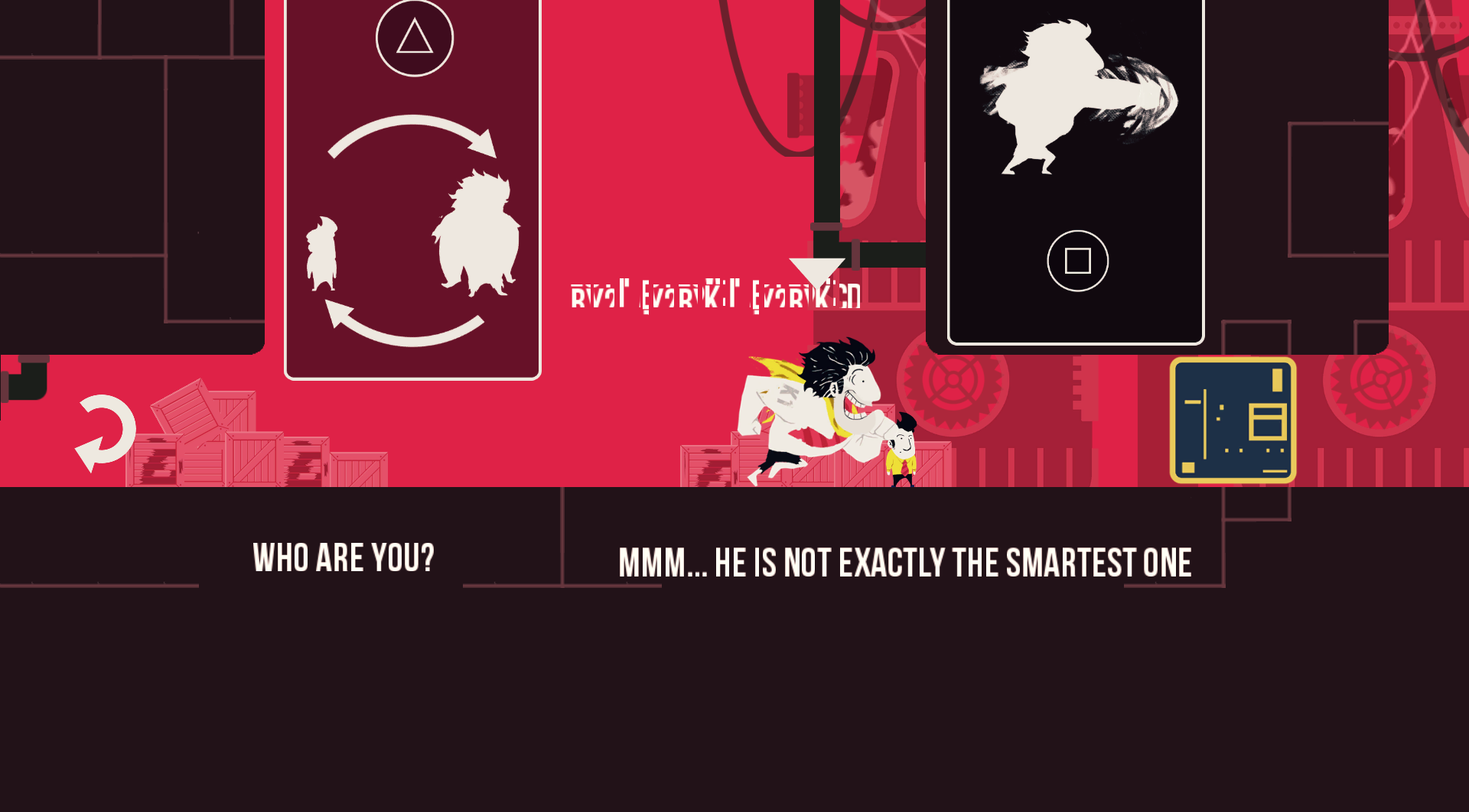
Waking up in a basement with no memory of who you are, let alone how you got there. The only clue is “KLAUS” written on your arm. This isn’t a new Deus Ex, this is Klaus.
Designed by La Cose Entertainment, Klaus is a 2D puzzle platformer that incorporates story seamlessly. The player moves the protagonist around the level, solving the platform puzzles to move onto the next stage and hopefully, towards some answers. The story is told through text on the screen, displaying the protagonist’s running thoughts about the environment to the player. The minimalist design focuses the attention on the gameplay and story.
La Cosa Entertainment took inspiration from a variety of sources. From minimalist electronic band Kraftwerk to animated works like Cowboy BeBop to even larger movements like German expressionism. The game is subtle and refreshing, alluding to rather than beating a concept into the player’s head.
Originally designed for a Square Enix game development competition for web and smartphones in Latin America, Klaus was a shot in the dark for the developers. Victor Velasco jumped in without really having an idea of what game he wanted to develop, but instead a desire to allow a new platform with new parameters shape the game.
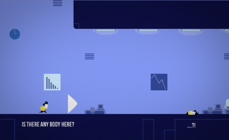
Settling on smartphones, Velasco wanted to break the platform and mobile games from the traditional game mechanic box. Winning 2nd place in the contest confirmed they were headed in the right direction.
Super minimalist design with a great soundtrack, Klaus is addictive. The story is intriguing, but I only got a glimpse of it in the demo. It reminds me of the film Memento though; we’re given only so much information at a time, but the protagonist immediately connects with the player. Klaus‘s story is communicated on screen in text strategically placed around the level.
Playing on a mobile screen, the text was a little distracting and I often forgot there was a story at all, but that was more about my expectations of mobile games than Klaus itself. In fact, the idea of mobile games with more story and a linear plot rather than repetitive grinding is not only appealing to me, but welcomed.
Klaus excellently capitalizes on touch screens for platforming and puzzle solving. The designers specifically wanted to break free of what we expect from games, so they decided there’d be no buttons on the screen. Originally created as a mobile game, La Cosa Entertainment knew to make the game they wanted, they would need to change two things: the player needed to interact with the environment as well as the protagonist and, therefore, the fourth wall had to be broken. Klaus has lots of potential, especially for a platform like Vita. This is the perfect game to use the touch screen capabilities of the Vita and will be a great addition to the Vita library.
The PS4 controller was a huge hurdle for the developers however. When part of the game’s premise is no buttons on screen, what do you do with a controller? La Cosa deftly deals with the issues, using button commands minimally to retain the original feel of the game.
Aside from the above-mentioned movie, the game also reminds me of Monument Valley in many positive ways. The progression of the levels, building on the game mechanics, and the interesting story are exactly what thrilled me about Klaus, just like with Monument Valley. The game’s mechanics are simple, which is perfect. The levels provide the challenge rather than complicated game play. The grading system adds replayability to the game.
The game is currently set to release next month and La Cosa is working hard. The tail end of development has the team focused on polishing the game for release, but also battling with the desire to add just one more element.
I’m excited to play Klaus on the PS4 and Vita next month. As far as what’s in store for the La Cosa team after the game’s release, there are no concrete plans, but plenty of ideas. La Cosa’s head PR Aleks Cuk replied, “Something is certain, as Saul Bass said we ‘want to make beautiful things, even if nobody cares’.”
 BrutalGamer Bringing you Brutally Honest feedback from today's entertainment industry.

