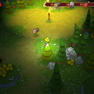
It’s pretty well known (at least to me) that Action RPGs are by far and away my favorite genre of video game. So, when 2 Zombie Games’ Action RPG Quest Hunter popped onto my E-Mail I was delighted. Quest Hunter boasts a unique story driven RPG with weapons, crafting, collecting materials, and humor. All of this sounds spectacular. I really pay attention to stories in games because I believe that they’re vital to my enjoyment. I want strong writing, well-written characters, and if humors tacked along too then that’s extra points. Sadly, while I believe that Quest Hunter excels in certain areas, the writing is one area where it definitely lacks.
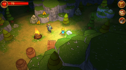
What first caught my eye as I booted into the game was how Quest Hunter has a very particular visual aesthetic, cartoony with bold dark lines around every object. It looks really stylish but it’s not a style that I particularly love. This game, visually, reminds me a lot of something that you’d see on the App store or Google Play store. Even from a game play perspective the game seems like something that you’d find for your phone. One thing I will compliment Quest Hunter on is the absolutely fantastic character portraits. They look really cool and while the writing did lack during the dialogue scenes, it was still nice to look at the character art.

To continue with the sentiment of this essentially being a phone game, the menus are controlled via the mouse but it’s not how you think. See, I would’ve preferred a series of menus that would divide everything by inventory, character level, damage and such. I would put it similar to Diablo III or Torchlight II. This would make the menus more navigable and fluid. Instead, you have to hold and drag your mouse to maneuver the menus. It seems like something that you would find on your iPhone. More and more I’m noticing that this game would fit really well on the App Store instead of on the PC.
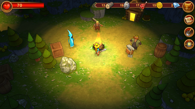
These are the three companions you pick up throughout your playthrough
The chunk I played of Quest Hunter took me through most of the core gameplay mechanics and provided a good tutorial. The main mechanics at play are attacking Bandits, Frog-things, and Lizard assholes, using light as a safe zone that wards off most monsters, and building and crafting a home as well as new gear and supplies.The combat is nothing to write home, it just gets the job done. Movement is done by clicking with the left mouse button and attacking with the right mouse button. In a way it reminded me a lot of the basic combat in Dragon Age II (minus all of the combos and spells).

I’m not sure why the monsters are scared of it but whatever!
Crafting seems to be a major component of the game. You can upgrade and purchase new weapons from a blacksmith that you find early in the game. He’ll provide you with your first sword and more weapons. You need materials to create items, be it a sword or the house that you see in the screenshot. Materials are gathered through chopping down trees and mining rocks.
I’m pretty sure that this isn’t the game for me. It just doesn’t feel like something that belongs on PC. While I understand that many games use this drag and move system menu navigation I just find it counter intuitive and unenjoyable. It may seem sleek but it lacks practicality and functionality. The writing is stilted and not funny. It’s amusing for sure but I think a lot of that comes from the beautifully detailed character portraits during dialogue. The combat isn’t some second coming but it’s good enough.
This game has a lot of potential but I really feel that some fundamental deign decisions are holding this game back from true greatness. It’s enjoyable and I’m sure that Quest Hunter will speak to a particular audience. I’m just positive that the audience isn’t me and that they’re not even on the PC. But, that’s not for me to decide. After all, Quest Hunter did get Greenlit. I’m excited to see what happens with the development of this game and I’ll definitely be monitoring it’s progress.
 BrutalGamer Bringing you Brutally Honest feedback from today's entertainment industry.

