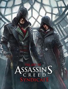
Titan Books’ latest tome goes back to late-1800s London to cover Ubisoft’s designs from the Victorian-set Assassin’s Creed Syndicate.
 So, kind of strange here since I’m a big fan of the fiction behind publisher Ubisoft’s Assassin’s Creed series, but I have yet to play Syndicate. The newest game in the series, Assassin’s Creed: Syndicate takes place in Victorian London, placing players in the roles of twin assassins Jacob and Evie Frye.
Though I haven’t delved into the game as of yet, our own score for it is respectable at 7.0 and I find myself drawn to it for the coolness of the setting alone. It’s urban for starters, which I’ve always liked for AC titles; I was a little put off by the more natural settings of III and IV to be honest. Though I know that might be heresy for some, I didn’t care for that theme.
With Syndicate though, there’s a rich amount of cityscape that can be explored. The time period is, after all, the ending of the Industrial Revolution, as Art Director Thierry Dansereau points out, and with that in mind there’s plenty of room for an art team to have some fun… in a historical sense of course. And from the looks of what’s contained in this tome, having fun with the setting is something that they definitely did.
Running 189 pages (plus an acknowledgement page), The Art of Assassin’s Creed Syndicate covers all the major elements of the city that was built for the game, and then some. While London is the main star of this book, there’s plenty more to be seen on the cast, and even WWI and the future, which we get tastes of.
Character studies for the twins span several pages each and spill over with gorgeous artwork showing design choices and clothing options- many of which were abandoned for the end product. What you get from all of it though is an excellent sense of just how much thought goes into both large and seemingly small decisions as goes the series. And it’s not just visual either as text boxes that talk in surprising depth about the ideas run right along with the illustrations.
From out of the characters, we move into the hardware for an exploration of the arsenal that the Frye’s take into battle. Guns, knives, brass knucks, explosives, and the latest evolution of that famous hidden blade all make for some excellent eye-candy before we move into the main course – London.
The city itself is broken up into 9 chapters, each one covering a different area that you’re able to dig into in the game. From Westminster to Whitechapel, the detail is fantastic. Author Paul Davies gets into every aspect of the design too, with not only the city itself talked about and shown off, but also the people that make up the inhabitance (including famed men like Darwin and Dickens), and the vehicles and transportation of the day.
You’ll also find many of the little changes that the development team made to the actual city, as it exists in the real world. Although most of what you see in Syndicate itself is pretty authentic to the era of London that’s depicted, there was some stuff that was added to make things more fun or iconic.
For example, the inner works of Big Ben are way less complicated than what’s detailed in a pivotal scene in the game, and the Trocadero and Eros Memorial weren’t built until after the dates that the story takes place across. In the case of the former, the designers thought that there simply needed to be more going on in the scene, and in the case of the latter, they couldn’t imagine The Strand without the landmarks.
And again, all of this is highlighted with some of the most beautiful and detailed art I’ve seen coming out of any game. The inside of the dust-jacket (which hides an awesome ‘Assassins’ logo hardcover by the way), mentions that the art brings to life the “…smog, clamor, and stench of Victorian London” and it most definitely does all of that.
Final Thoughts
I was pretty taken with The Art of Assassin’s Creed Syndicate. I am, most definitely, a sucker for a good art book and this is all of that.
Beautifully rendered illustrations that cover characters, elements, and the city itself coat the heavy-stock pages and are flanked by facts and descriptions of the thoughts that went into the designs. If you love behind-the-scenes stuff and Assassin’s Creed, then this book is for you.
It maybe could have been a bit longer, capping off at 191 pages, but you do get a thorough look at Victorian London, a quick trip through World War 1, and even a taste of what’s happening in the present day of the AC universe- and all done without spoiling much! No mean feat.
With all that, there’s plenty for fans to sink their teeth into and more than enough to have you pulling this volume down from the bookshelf from time to time for another look.
*This review is based upon a copy of The Art of Assassin’s Creed Syndicate supplied to BG by Titan Books.
 BrutalGamer Bringing you Brutally Honest feedback from today's entertainment industry.


