Gou Tanabe’s “At The Mountains Of Madness” Volume 1 adaptation is a wonderful combination of realistic illustration, classical storytelling and H.P. Lovecraft’s original work. This stunning artistic retelling of the cult classic is nearly flawless. The design work throughout the volume is simplistic yet of a professional quality. It is deliberate and adds to the feeling of horror and a sense of dread. I see this as an absolute treat for fans of Lovecraft’s work and recommend it to those familiar with his style of storytelling.
Plot
A scientific expedition in the Antarctic set in 1930 goes terribly wrong when radio contact from one of the teams is lost due to a violent gale unlike anything ever seen. Prior to the radio silence, the team had made an “astounding discovery”. The rescue team arrive at the campsite, only to find the site destroyed in an unnatural, disturbing manner. Later, their worst fears are realised when they find their dead colleagues, stripped to the bone…
Story
The story is adapted from the original “At the Mountains of Madness” by H.P. Lovecraft in 1931. The original story has a slow pace, detailing the operations from the first person perspective of Professor Dyer. In Gou Tanabe’s adaptation, Dyer narrates at times but the characters interact and speak to each other adding another dimension to the tale. The story is fairly slow paced as it was in the original but much of the wordiness has been stripped out. This is due to character interaction and visual storytelling. The story is, so far, almost faithful to the original with a few details skipped over, I assume, for streamlining the story.
Art
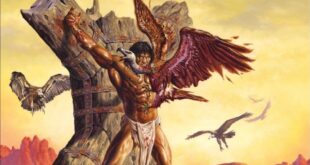
The illustration style is difficult for me to categorize but it reminds me of old adventure comics and engravings/etchings. Fairly realistic with little stylistic choices. It gives off the impression that each panel is an old black and white photograph. There are also plenty of intricate double page spreads. If it weren’t for a few oddly proportioned dogs and weird side eyes here and there, I’d have said the illustrations were pretty solid. There are also a few full page color illustrations.
The design work, as mentioned above, stands out as premium. The design reminds me of classic literature front covers and layouts. Chapters are divided by black pages with titles in a clean, sans-serif, white font. The English translation keeps some of the Japanese characters (Hiragana?) as well for subheadings.
Overall
Gou Tanabe’s “At The Mountains Of Madness” is incredibly intriguing. Not only is it very polished and accurate for an adaptation, it’s origin is all the more odd when spoken aloud. It’s a visual adaptation written in a Japanese manga format and illustrated with a Western comic book artstyle by a Japanese artist of an American author’s novella that told the story from the first person perspective. Phew! It is just as strange as the Elder gods themselves!
That damned Necronomicon!
Art - 95%
Design - 100%
Story - 90%
95%
FHTAGN!
A Western styled comic done by a Japanese mangaka, Tanabe's At The Mountains Of Madness should be categorized as classic literature. A faithful adaptation, easier to read than the original and well presented.